
Journal
Design & illustration inspiration, tutorials and latest news.

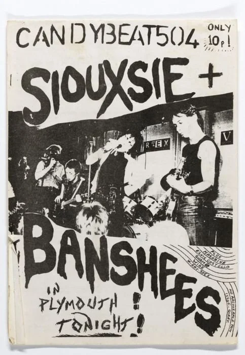
Why Punk Rock Posters Are the Ultimate Graphic Design Inspiration
If you’re looking for a fresh jolt of creativity, forget the design textbooks and take a deep dive into the world of punk rock posters. These gritty, DIY masterpieces aren’t just great advertisements for gigs—they’re pure, unfiltered energy splattered across paper. Whether you’re a designer, an artist, or just someone who loves the music, punk posters are an endless source of inspiration 🤘
Punk rock is all about breaking the rules, and its posters follow the same philosophy. Unlike the polished, grid-based designs we see everywhere today, punk posters often look like they were thrown together in a basement with whatever was available—scissors, glue, a Xerox machine, and a bucket of ink. But that’s the beauty of it. The raw, imperfect style gives each poster a unique character, reminding designers that creativity isn’t about perfection—it’s about impact.
1. Bold Typography That Screams (Literally)
Forget about clean, legible fonts—punk posters are all about type that looks like it’s been scratched onto a bathroom stall or torn from a ransom note. Jagged, hand-drawn letters, ransom-style cutouts, and distorted text create an aggressive, in-your-face attitude that demands attention. Even if you’re working on a sleek brand campaign, injecting a little punk typography can add much-needed personality and punch.


2. High-Contrast, Eye-Popping Colours
Neon pink against black. Blood red smeared over yellow. Punk posters embrace loud, high-contrast colour schemes because they’re meant to be seen. The goal? Grab your attention in the fastest, most visceral way possible. Even in more refined design work, borrowing from this bold colour approach can make your work more dynamic and unforgettable.
3. Collage & Cut-and-Paste Chaos
One of the most iconic elements of punk poster design is its use of collage. Torn-up newspapers, scribbled-over photos, and haphazardly pasted elements create a sense of movement and rebellion. This chaotic, layered look makes the viewer feel like they’re part of the action rather than just observing from the sidelines. If you’re stuck in a creative rut, try incorporating some old-school cut-and-paste techniques into your digital designs—it might just unlock a whole new energy in your work.


4. Pure Attitude & Emotion
More than anything, punk rock posters radiate attitude. They’re loud, unapologetic, and full of feeling. Unlike sterile, corporate design, punk posters don’t try to please everyone—they exist to make a statement. That’s an important lesson for any designer: don’t be afraid to inject emotion and personality into your work. People connect with designs that feel real, and nothing feels more real than the raw, untamed energy of punk.
So the next time you’re feeling creatively blocked, dive into the wild world of punk rock posters. Flip through old gig flyers, experiment with bold typography, or just grab some scissors and start collaging. Punk design reminds us that creativity isn’t about following trends—it’s about making noise, shaking things up, and, most importantly, having fun.
Now go make something that kicks ass.


Want more? Check out my Pinterest board 🤘

Vintage Band Tickets: a Hidden Gem for Killer Design and Typography Inspiration
They don’t make them like this anymore!
In the digital age, where sleek and minimalistic designs dominate, there's something undeniably captivating about the raw, vibrant, and often chaotic designs of vintage band tickets. These little pieces of history are more than just memorabilia—they are miniature masterpieces of graphic design and illustration, bursting with character and artistic ingenuity. Whether you're a designer, an illustrator, or simply a lover of nostalgic aesthetics, vintage band tickets offer a treasure trove of inspiration.
Check out my Pinterest board for more ✌


How to convert your illlustrations to digital vector in 4 easy steps.
CONVERT YOUR ILLUSTRATIONS TO DIGITAL WITH THE HELP OF ADOBE PHOTOSHOP.
This is the method I use to convert my illustrations to digital vector. As with anything Adobe related, there are probably a million different ways to do this, but this is the way that works for me!
You can also use it for hand lettering, logo design or just about anything!

**Before you get started, if it isn’t already, you need to outline your sketch in ink - pencil won’t cut it! **
STEP 1
Scan or photograph your illustration.
Scanning is preferable, but don’t worry if you don’t have one - I don't! A high quality photo works just as well with a bit of work.
Scan:
If you can, make sure your scanner settings are set to the highest resolution.
Photograph:
Good lighting is a must! Bright, natural light is best but you can also use artificial lights, such as lamps or spotlights. The key is making sure your illustration is evenly lit (this will help you later on). Don't worry if the photo is slightly discoloured, we will fix that later!
When taking the photos, try to make sure the camera is aligned directly above the illustration (as best as you possibly can) and the drawing is flat (I use a bulldog clip to pin the pages down in my sketchbook).
Take a few so you can choose the best one!
STEP 2
Open your scan/photo in Photoshop.
Now we start editing! You want to make your blacks as black as possible and whites as white as possible.
I usually start by cropping and straightening my image. Then convert it to black and white to make sure there is no hint of colour. Play around with the brightness/contrast, levels and exposure until you are happy.
*No two photographs/scans are the same, so it is usually a case of playing around until it works!*
STEP 3
Select your illustration using colour range
Now we want to isolate the drawing. Go to Select > Colour range and a panel will open up. Click your illustration and increase fuzziness to max then click ok. Ta-dah! You have selected your illustration.
STEP 4
Convert to paths and export to Illustrator
Now you want to convert your selection to a path. Go to the Path panel (if you can’t see it, you can open it in Windows>Path) and click the middle icon at the bottom of the panel. It looks like a circle with four squares around it and if you hover over it says ‘make work path from selection’ *see below*
Now your illustration is a path and can be exported to illustrator! Go to File>Export>Files to Illustrator and save it wherever you want. It’s that simple. Once open in Illustrator you can do what you want with it! The wonders of digital vector...

18 Beautiful Vintage Matchboxes for Endless Design Inspiration
VINTAGE MATCHBOXEs: a graphic designers dream
If you have browsed design inspiration on Pinterest, you might have stumbled on vintage matchboxes before. They are a graphic designers dream; quirky illustrations and typography, imaginative layouts and bright colours, all crammed onto a tiny hand-held package. As I came across more and more, I started to wonder about their history. Why they are they all so damn cool?

A brief history
The safety match was invented somewhere around 1850 and was somewhat of a ‘game changer’ at the time.
Up until then, various matches existed but were pretty hellish and unsafe to use. One match was made mostly of sulphur and was lit by dipping it into an asbestos bottle filled with sulphuric acid. Yikes.
Another involved the use of white phosphorous, not a nice chemical by any stretch of the imagination. Put it this way, one matchbox would contain enough of it to kill a person (and it actually became a popular suicide method - fun!)
Even worse if you worked in the factory making them - you would most likely develop “phossy jaw”, a degenerative bone disease which literally made your jaw fall off. No joke.
Needless to say, back then you probably didn’t want to play with matches…
matchbox art
The birth of the safety match changed everything and marked the beginning of the matchbox art heyday. As the matches needed to be struck, the box had become an essential part of the packaging. Matchbox companies realised that to entice people to buy their boxes, they needed to appeal to their interests with eye-catching, colourful designs. That’s when things got interesting.
In the 1800/1900s, “cool” stuff included things like celebrities (war heroes, monarchs) new technology (trains, planes, industrial stuff) and animals (my personal favourites!).
This drive to impress and entice is probably why I love them so much; it really feels like creativity was encouraged, that the designers were told to experiment, be bold. They wanted to delight and excite the user every time they pulled it out to light a candle or smoke a cigarette. This creative freedom led to some truly amazing, if very tiny, works of art.
Anyway, check out a small selection of my favourites below. If that’s not enough for you, check out my Pinterest board and get stuck in!


